Showing posts with label Technical. Show all posts

Saturday, March 13, 2021

Technicals: Accounting for Income Tax on Bonus Options

According to ボーイフレンド one very important factor in investing where there is very little coverage for its significance is the implications of taxation and the role it plays in our decision making. I believe this to be true. As someone who has spent over twelve months of their life studying income tax in my tertiary studies, it is a subject that I try very hard to block out of my memory, but remains an unavoidable area of life. Unfortunately it keeps catching up with me, even moreso since I've started investing. So when he posed me a question a few weeks ago pertaining to the Capital Gains Tax (CGT) implications associated with our WGB options, I took it upon myself to dust off my trusty Income Tax Assessment Act (1997) Cth (ITAA) and work out the answer.

"In this world nothing can be said to be certain, except death and taxes"

Capital Gains Tax

It would be of assistance to commence our analysis with a definition of what constitutes CGT which is a tax levied on the sale of a capital asset such as shares or property, the gains (or losses) are the difference between what you get when you sell it compared to when you bought it. Although it is known as CGT and would appear to imply a separate tax regime outright, the gains are actually counted as your income and levied at the marginal income tax rate.

In Australia, since 21 September 1999 there is a 50% CGT discount applied to gains made on capital assets which have been held for longer than 12 months, which is a very important rule in our later calculations.

Although these concepts may seem simple to begin with, it becomes very complicated when we consider it within the context of bonus options. 

Scenario

As mentioned in previous posts, WGB is a share which ボーイフレンド and I have been regularly DCA-ing into during the big crash of 2020. So rather than buying it in a lump sum we have purchased it across multiple months which would in turn affect our eligibility to get the CGT discount. Lets assume our purchases were as follows and run through the options for their tax implications:


Option 1: Sell all the options

If we decided to sell all the options outright immediately this would mean that we would be selling 6614 options at a price of $0.13 per option.

Capital Gain = Selling Price - Cost Base

                    = $0.13 x 6614 - $0

                    = $863.33

However in accordance with the rules pertaining to CGT discount, as it is currently 13 March 2021, there would be 874 options which would be eligible for the discount. 

At a marginal tax rate of 37c your CGT on the exercise of the options would be $746.20 x 0.37 + $113.62 x 0.37 x 0.5 = $297.11

After tax returns being $562.71

Option 2: Exercise all the options, sell the original shares

Given the presumption that we do not intend to add to our total amount of shares held, our next option is to exercise all the options thereby doubling our share holding and then selling our original holdings. If we did this, we would have no CGT on the shares we gained from the options we exercised but we would be paying CGT on our original shares.

Capital Gain = Selling Price - Cost Base

                    = $16,799.78 - $14,000.00

                    = $2,799.78

As mentioned, the earlier purchases would be subject to the CGT discount which means that 874 shares purchased in Jan and Feb 2029 would be eligible.

At a marginal tax rate of 37c the CGT of the exercise would be $2,581.38 x 0.37 + $218.38 x 0.37 x 0.5 = $955.91

After tax returns = $1843.87

This may appear more favourable however the cost base of the 6614 shares we retain will now automatically be $2.54 and the acquisition date will become the date that we exercise our shares i.e. 13 March 2021. This means that we will definitely have to hold on to them for a further 12 months for the CGT discount to kick in. 

Option 3: Exercise all the options, sell the new shares

The third option involves exercising all the options but instead of selling the original shares we held, we sold the new shares. 

As per the ATO website, when options are exercised, the acquisition date of the shares is the date in which the options are exercised. If we exercised the shares today, the cost base of the share would be $2.54 the cost base would also have to include the market value of the option currently, i.e. $0.13.

As such, if we exercised the option and sold the share immediately, we would be incurring a capital loss of ($2.54 - ($2.54 + $0.13)) x 6641 = $863.33

If we applied this loss on another capital gain that we make in the current year (or future years) this would reduce our earnings by the equivalent amount, thereby resulting in a net cash gain of 37c in the dollar, being $319.43.

Although this is a lower figure than the other two, what also needs to be considered is the fact that the shares still retained on hand have a lower cost base but have been held for longer periods of time and will potentially be able to get the CGT discount upon sale.

Conclusion

Based on the above calculations, it appears that the answer is that if the goal were to get a maximum short term gain, Option 2 provides this at a moderate cost of future gains which have yet to be determined. Option 3 appears least favourable of the three and would not be recommended.


Disclaimer: The material on this post (and blog) is provided for general information and educative purposes in summary form on financial topics which is current when it is first published. The content does not constitute legal or financial advice or recommendations and should not be relied upon as such.


Appropriate legal and advice should be obtained in actual situations.
by 小福

Friday, June 12, 2020

Maths: Greek

In the course of my reading what I consider to be fairly technical financial reports and analyses, I often come across references to Greek. Having covered them briefly in the finance courses of my commerce degree years ago, I thought that it would be a good time for a slight refresher on what I already know in addition to learning things whilst providing a reference guide for the future. 


The first two Greeks that I'll discuss relate to the broader notions of investing and have a fairly wide range of applicability while the remaining deal specifically with options.

Risk Ratios

Alpha

Alpha is defined as excess return on investment when compared to an indexed benchmark. Therefore alpha is calculated as actual rate of return less benchmark rate of return. The resulting figure gives an indicator of whether the investment over-performed (if the number is positive) or if it under-performed (if the number is negative), essentially providing a measure of relative return.
A positive alpha indicates an investment had a good return given it's underlying risk whilst a negative alpha indicates the opposite.
When people say they have a high alpha, it means they have a tendency to outperform the market.

Beta

Beta is defined as the measure of relative volatility compared to the market as a whole. It is used to measure systemic risk of a portfolio when compared to the benchmark.
The formula for beta: 
Although it looks fairly complex, it can easily be calculated with excel by using variance and covariance formulas.
By definition, the market as a whole has a beta of 1. A resulting number of less than 1 indicates that it is less volatile than the market which can often be found in lower risk investments such as bonds or gold. A higher beta indicates that it has more volatility than the market. For those who dabble in inverse indices, a negative beta demonstrates that the investment moves in the opposite direction of the market.
High beta vehicles often offer higher returns whereas low beta investments offer lower returns. By utilising the Capital Asset Pricing Model, one can then derive what a fair return on investment ought to be given any beta.
In combining the two, it can therefore be concluded that the most attractive investments are those that offer the highest alpha with a low beta.

Options Greeks


Delta

For those who remember from their high school days, Delta is a measure of change. In the finance context it measures the rate of change of an option with the change in underlying asset's price.
The formula for delta:
The resulting number ranges between -1 to 1 with negative numbers for puts and positive for calls. Delta represents the change in the price of the option for every dollar movement of the share.
Options which are deep In The Money (i.e. calls where the market price > strike price and puts where market price < strike price) will have a delta closer to one whereas options which are deep Out of The Money will have delta closer to zero. In practically applying delta, it is often used as a rough indicator of the probability that the option will expire in the money. A delta of 50 would mean that it has roughly half a chance of profiting by expiry. The higher the delta the more chance you have of profiting, but usually this would correlate to higher premiums for the contracts.


Gamma

Again one from high school mathematics, Gamma represents the derivative, that is rate of change of Delta with respect to the change in the underlying asset's price.
The formula for gamma: 
Simply put, gamma is to delta as acceleration is to speed. Gamma is always positive and highest when the option is closest to At The Money (market price = strike price). It is sometimes called the "Uncertainty Factor" because of this, since when options are closest to  ATM the higher the chances that it could end up either way.
Practical example, if a stock had a value of $100 with the correlating call having a delta of 0.45 and a gamma of 0.05, when the stock goes to $101, the delta becomes 0.50, so the value of the premium goes up correspondingly.


Theta

Theta is a function of measuring an option's time sensitivity. It gives an indication of the change in the value of the contract given a one day change in time.
The formula for theta:
Short options, that is selling contracts, has positive theta whereas long options have negative theta because the closer you get to expiration date, the less the underlying contract is worth because of the lower probability of market value making the required strike price. By way of example, a Theta of -0.10 means that every day that the stock price does not move, the value of each contract will reduce by $0.10. The lower the theta, the slower the rate of decay is on the contract.
For those who browse forums as much as I do, you may have come across the term Theta Gang. Theta gang represents those who sell options to profit from the decay in value when it expires OTM.


Vega

To clarify, Vega is not actually a Greek letter, rather it uses the letter nu, but as the character bore similarities to the letter v, it has been named vega in line with beta and theta. It measures the change in the option's value with every percent change in implied volatility.
The formula for vega: 
All options have a positive vega. When implied volatility is higher, options are worth more as people think that there is a higher likelihood of meeting the required strike price. As such, with the most recent volatility in the market, options would have sold for a far higher premium and as volatility subsides they will be worth considerably less, hence the term IV crush.

Though I have little intention to dabble in options, having a good understanding of the above is always useful when assessing other's option purchases to consider their viability. It's also very interesting to learn on the side anyway.

by 小福

Monday, May 25, 2020

Obiter Dicta: CAPE Ratio

Having recently written a bit on the Sharpe Ratio reminded me that I hadn't actually covered the CAPE ratio on my blog. This was particularly surprising as it was one of the first things that ボーイフレンド taught me, even before I had started my own portfolio.

Invented by the Nobel Prize winner Robert Shiller, it stands for Cyclically Adjusted Price to Earnings Ratio, also known as the P/E 10 Ratio. Starting again on fundamentals, PE ratio is one of the first tools that you learn in finance. It is simply calculated as follows:


It is a very blunt instrument that provides rough guidance on whether or not a share is overpriced. The higher the PE ratio, the more likely it is that a share is overvalued or a high growth is expected, vice versa, the lower it is the more likely it is undervalued or slow growth is expected. In comparing PE ratios, it is best to compare with competitors in the same industry or with the company's previous years' performance to ensure consistency of benchmark. Being a very simplistic indicator, it doesn't take into account projected earnings, especially for startups which may yet have started turning over a profit. It is also often limited by fluctuations experienced annually throughout the course of a business cycle.

This is essentially what lead to the creation of the CAPE ratio, to smooth out fluctuations in corporate profit over a decade. The formula for CAPE ratio is:


The use of the CAPE ratio for individual companies is largely to assess the long term financial performance to determine whether or not a share is over or undervalued. Limitations of the ratio include the fact that it is always only backward looking rather than forward looking and it doesn't take into account changes in accounting standards which may also affect the figures used in the calculations.

Other than for individual companies, I find that a far more useful application of the CAPE is in considering the historic CAPE ratio for an individual country. The CAPE Ratio by country is calculated by averaging a country's average equity price by their ten year average inflation adjusted earnings weighted by market capitalization. The resulting figure provides an indicator on whether or not the country's stocks are considered over or undervalued.

When considering a country's current CAPE ratio to it's historical average, we can determine the propensity for a substantial corrections in it's equity prices. From the chart below, it is clearly apparent that the crashes in US and Australian stocks corresponded to a much higher than average CAPE ratio, notably the dot com crash and the GFC. Therefore in the short to medium term, investing in a country with considerably above average CAPE ratio is likely to result in lower than expected returns in the foreseeable future.


It is also of interest to note that different countries' CAPE ratio cannot be compared against each other because different countries specialize in different industries with different average PE ratios, so a country's CAPE ratio ought only to be compared with it's own historical average.

Given the above, there is little doubt as to why CAPE ratio poses such a useful tool in measuring not only a company's stock but for a whole country's projected future performance. Definitely a worthwhile indicator to consider when assessing future investments.

by 小福

Monday, April 27, 2020

Obiter Dicta: Sharpe Ratio

The relative calm of the recovering market means I have had more time to ponder theory surrounding financial mathematics rather than the pragmatic application of theory to real life when a crisis is unfolding. 

Having gone through the recent downturn and observed the gains by some investors, it made me wonder whether or not return on investment was the single best measure of performance. Considering that some have taken higher risk than others to achieve comparable returns, I recalled  ボーイフレンド had mentioned that the Sharpe Ratio was a good measure of this, so it was time for a bit more technical research.

The Sharpe Ratio is calculated as follows:

rx is the rate of return for the investment
Rf is the risk free rate of return, which we can take to be the RBA cash rate (currently 0.25%)
StdDev(rx) is the standard deviation of the portfolio. A guide on calculation can be found here.

The higher the Sharpe Ratio of your portfolio is, the better the returns are at the undertaken risk. As good a tool as it is, the Sharpe Ratio does come with drawbacks, substantively the premise that the lower the volatility, the better the portfolio, it negates the positives of upside volatility. Those who are familiar with the formula are also able to cherry pick performance to demonstrate stable earnings to boost risk adjusted returns as well, so as with most blunt instruments, due consideration needs to be given in application.

In the end, both return and risk need to be considered when evaluating whether or not a portfolio is superior. Just because you took a very high risk and it paid off handsomely doesn't make you a skilled investor so much as it means that you are a lucky gambler (for now).

By 小福

Friday, April 17, 2020

Case Study - BBUS and BBOZ: The First One's Always Free

Those who have been dabbling in stocks during the most recent period of volatility will undoubtedly have gained invaluable experience in the market during the Feb to April downturn and subsequent uptick. In summary, from 19 Feb to 23 Mar, the S&P 500 lost 33.9%, making it the fastest crash in history. This was followed by growth of 17.5% from 24 to 26 Mar, being one of the biggest three day gains for almost a century. It would not be an exaggeration to say that what we lived through was truly extraordinary. What was even more amazing was to watch the market response to these violent movements. 

As my readers will now have discerned, my investment strategy has been a fairly conservative one where I dollar cost average twice a month, largely into index funds and by exception individual shares where they appear to be of exceptional value and worthy of the additional risk involved. Whilst I stuck to my plan throughout, I have found it to be infinitely fascinating to watch the response of average retail investors who succumbed to the dark side and were burned hard by the market. 

In observing the people around me and a plethora of online forums, there were two main poisons which decimated portfolios, one was Put Options, the other was Inverse Indices. Today's topic of discussion will revolve around two highly popular inverse indices, BBUS and BBOZ. 

 
The simple way to explain inverse indices is that it is exactly what the name purports, an inverse of an index fund. While BBUS is a leveraged inverse of the S&P 500, BBOZ is a leveraged inverse of the ASX 200. By utilising futures contracts, every 1% lost in the relevant index results in a 2% to 2.75% gain for the holder. As you can envisage, this became a highly attractive investment vehicle to make some gains during the intense drop. Although it may sound like a good idea to buy when the market is falling, there are a number of reasons why a beginner or even novice investor shouldn't touch these products.

Market Timing

When you buy into index or a fairly stable blue chip share, it is almost an inevitable outcome that the shares will go up in the long run. Since BBUS and BBOZ are inverse indices, they obviously go down in the long run as demonstrated in the chart below.


When you look at the prices for BBUS in the last several months the returns look extremely attractive after the fact. If you bought on 20 Feb for $2.67 per unit, this would have become $6.63 by 23 Mar. However, given the state of the economy on 20 Feb, who would have been able to foresee the impending crash and buy into BBUS? Very few. Given the uncertainties surrounding the impacts of coronavirus on the economy and subsequent fall out, most people held onto their portfolios for at least several days until a downward trend was established when it was somewhat higher in price. I know of at least one friend who put their whole portfolio into BBUS at peak for $6.63.

Given investor psychology surrounding the Dunning Kruger effect, even the investor who bought in at the peak was determined that the falls were not yet over and any minor dips constitute bear market rallies and the big crash has yet to come. Of course the media also fanned flames during this period, hyping up death stats and forecasting the end of civilization as we know it, but the unsavvy investor failed to realise that this was already priced in when the market tanked. As a result of this, they consistently held on whilst their portfolio was was violently wiped out.


As of today, BBUS currently stands at $3.39, almost down to what it started on. Are we in the middle of a massive dead cat bounce and the big crash is still coming, or whether we are in for a V shaped recovery? I don't know, which is why I will continue with my dollar cost averaging. Short of being able to accurately time future market movements, it would be imprudent to purchase such a risky vehicle. Having said that, if you are able to accurately foresee the future, why wouldn't you just maximize your gains on minimal cost by buying next week's lotto ticket and min maxing your profits.

Compounding Risk aka. Volatility Decay

Another reason why leveraged inverse indices shouldn't be held for an extended period of time, but isn't apparent to most until demonstrated by a worked example.

For simplicity, let's do two worked examples on the following parameters:

  • Starting portfolio is $10,000
  • Every day the market moves up or down 1% (10% in the other simulation) returning to parity every second day
  • For simplicity we will take the leverage of inverse index at a multiple of 3.


As you can see, whilst market returned to parity every second day, the value of the portfolio was gradually reduced, whilst the results were subdued when volatility was small, when movements were violent, decay was also extremely brutal. Given the fluctuations of the last several months, I have no doubt that quite a few people suffered considerable losses from volatility decay.

For further clarity, consider the fund strategy that BetaShares proposed for both BBUS and BBOZ whereby returns of 2% to 2.75% for every 1% drop are only for any given day, thereby indicating that those returns cannot be expected to continue for periods over one day.

Expenses

Due to the nature of inverse indices attaining their benchmark leveraged returns through use of complex mechanisms like derivative contracts, the associated expenses of high fees, high transaction costs and re-balancing costs also eat into returns considerably. Although simple, for someone who puts money into ETFs for their low management costs, this is clearly reason why inverse ETFs should be considered with a grain of salt.

Conclusion

The last months have provided me with precious insight into the workings of the human mind and how the fear of loss coupled with greed to make gains have pushed innumerable investors to the dark side. From moderate gains during the remainder of the bear market to the eventual wipe-out with the recent rally, millions have been lost on the market because The First One's Always Free and the lure of quick gains is intoxicating. For this, I am grateful to have held firm to my resolve and weathered the storm.

It has also provided a practical example to ボーイフレンド as to why retail investors often under perform when compared to index returns.


As a final point, for those who are wondering. Mr A, who got bored of checking on his brokerage account and continued to DCA through the dip on a preset diversified spread has now returned to -13% on his portfolio whilst the market is still at -20% from peak, outperforming everyone that I know personally.

By 小福

Monday, April 6, 2020

Case Study: On UNV, TER and margin of safety

One highly technical post calls for another. I hadn't intended to go into another so soon but due to the recent chain of events, it was too good an opportunity to pass, so today's post will be on the complete debacle that was TerraCom's (ASX: TER) purchase of Universal Coal (ASX UNV). In the words of ボーイフレンド it was basically a murder suicide with retail shareholders forming unwitting collateral damage. 

All good stories though, start from the beginning. So that's where we will commence. Late last year ボーイフレンド was considering industries that would be likely to outperform in the medium term. With a fairly contrarian perspective compared to the average retail investor, he decided that with the uprising popularity of renewable energy and the social pressures surrounding ethical funds, traditional fuel sources like coal and oil would be fairly discredited and undervalued in the short term. As a result of this, he and Mr D started looking into individual companies in the industry for potential individual picks for investment. 


In their research, they came across UNV, a London based Thermal Coal company with operations in South Africa. One look at their financials shows why it was such an attractive company to buy into. With steady growth in revenues, reasonable and proportionate expenses, healthy cash flow, a history of generous dividends as well as excellent asset to liability ratios whilst management also appeared to be sound. In applying discounted cash flow models to value the shares, ボーイフレンド determined that each share was worth within the vicinity of 0.6 to 0.9 which obviously meant that his purchase price of 0.24 when the PE was about 5 (and my subsequent purchase at 0.23) was definitely a steal, so we purchased a small amount of holdings each.

For reference, I have extracted some financials of UNV current as of 6 Apr 2019. Although there has been a bit of time lag, you can definitely see the solid fundamentals in the reports.


Testament to the unpredictability of stocks and also a lesson in the importance of diversification, the unexpected did in fact happen and TER, an Australian based coal producer with projects in Queensland and Mongolia launched a takeover bid for UNV. Judging by the condition of the health of the company from its financial reports, it was easy to see why they wanted the takeover. TER had sustained a couple of years of losses with an increased net loss projected in the current year with an indeterminate time for return to profitability despite an increase in revenues. Cash flows were abysmal and assets to liability ratios were not ideal. This was definitely not a company that I would want to hold.

Again, for reference, I extract a copy of the financials currently posted on 6 Apr 2020.


Under the offer, UNV shareholders will get 10 cents in cash and about 0.6026 new TER shares for each UNV share held. As at the point where we were made this offer, TER was selling at around 0.24 per share. This meant that accepting the offer, I would break even at 10 cents plus roughly 14.4 cents of TER per UNV.

At this point, the board of UNV issued advice to shareholders not to take any action with respect to the unsolicited bid whilst they instigated litigation to suspend voting rights of TER but strangely three members of the board itself Tony Weber, Shammy Luvhengo and Hendrik Bonsma proceeded to accept the offer on 22 March 2020, raising serious concerns to me about acting in good faith when they undertook a course of direction to which they advised shareholders not to. In the end, ボーイフレンド and I held out to the end and didn't accept until we saw that 75% of shareholders had accepted. The final figure stood at over 90%.

Within a couple days my cheque for $4,347.80 arrived in the post and 26,200 shares of TER appeared in my SelfWealth Account. The cheque was easy enough to bank and transfer back into my SelfWealth but the 26200 shares of TER were a lot harder. There was no doubt in my mind that TER was not a company to hold for the long therm, but with the continued falling price and no fundamentals to even justify a potential rebound at a later date, there was nothing to do other than to sell.

Initially when I was first issued my shares, TER was trading for around 14 cents per share, wanting to break even at around 17 cents, I held on as I watched it drop to 12 cents, by which point ボーイフレンドcashed out. Holding for another two days, I finally gave up and sold for 10.5 cents per share, the lesson to be learnt is apparently not to be greedy, because even though you may hope that a share may go up, without sufficient justification as to why it ought to go up, it has just as much or maybe even more reason to go down.

In the end, my $10k investment in UNV resulted in a payout of $7,098.80. Although by absolute figures this was a pretty big loss of almost 30%, given the most recent drops in the market, the outcome was largely the same as what I would have gotten if I had bought into index instead. If nothing, this highlighted to  me the importance of making individual purchases with a generous margin of safety, because if individual equities are not bought at a price that is significantly below their intrinsic value, when unexpected situations like this do happen, the losses that are sustained could be critical indeed.

As to what I put my $7,098.80 into? VGE and WGB.


 By 小福

Monday, March 30, 2020

Obiter Dicta: On Sentiment

My last post provided a fairly light hearted introduction on informal measures of market sentiment, but during these uncertain times I tend to reflect upon the copious amounts of reading I have done on sentiment to try and get an understanding of where we are in the current climate.

Two books that I have recently finished, Mark's The Most Important Thing Illuminated and Neill's The Art of Contrary Thinking highlighted that market sentiment often swings in a pendulum like motion between extreme fear and extreme greed. One way for an investor to make significant gains is to recognise where we are in the market thereby exploiting opportunities as they arise. By and large the most gains can be made when you can keep a cool head and calmly make purchases when the majority of the population are panic selling and selling (or at least reducing purchases) when prices start to overheat. As such, I have spent a considerable amount of time pondering sentiment and relevant indicators and have made the following observations of different gauges.

Quantitative Indicators 

Stock Market Price

It would be hard to argue that there is a stronger indicator of market sentiment than the market pricing itself. In stating the obvious, the current price of a stock clearly represents what the market considers to be fair value as at that one point in time. The PE ratio gives a ratio of earnings per share to each share price which in turn provides rough guidance on whether a share is over or under valued. A further step would be to consider the Forward PE ratio to gauge the expected growth and earnings. The higher the Forward PE ratio the higher the predicted growth of the stock which gives a crude starting point for the market's disposition.

Relative Strength Index

The RSI is a momentum indicator that provides a measurement on whether stocks are currently overbought or oversold. The calculation for RSI is fairly complex:


N is often taken to be 14.

The result is a number between 0 and 100 whereby 50 indicates that stocks are neither oversold or overbought, a number closer to 100 indicates it is overbought and a number closer to 0 signals under bought. A range between 30 and 70 is considered fairly normal.


Using the current example of what has just happened locally, you can see that the market crash at the end of February corresponded to a sharp decline in RSI correlating with in a massive oversell of equities in March. A savvy investor would then recognise the market panic from these charts (amongst all the other factors) and may draw the conclusion that it would be a good time to make some purchases of some good quality value equities for a good price.

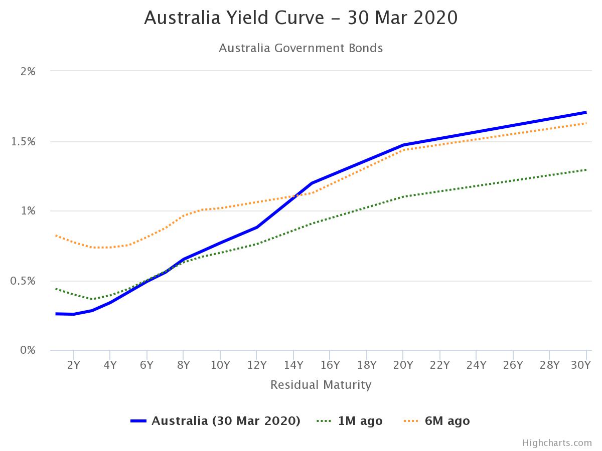
Bond Yield Curve

The Bond Yield Curve has recently been cited often as an indicator of impending recession, however there is far more information to be gleaned from it than just the one omen of impending doom. Going back to basics, a bond's yield tells you what the annualised return is from purchase to maturity. As is with the laws of uncertainty, it is riskier to purchase a bond for a longer duration than a shorter one (because you can never really know for certain what will happen in the longer term future) and accordingly in normal situations long term bonds will tend to attract a higher yield than short term.

For reference, our current bond yields in Australia are as follows:


Our current yield curve looks like this:


Different orientations of the curve give different hints to what can be expected in the future.

Normal Curve - has a lower short term yield with a mild increase to mid term and long term. This indicates a normal level of confidence about the future.

Steep Curve - has a lower short term yield with a much greater mid and again much greater long term yield. It is a very bullish signal and has historically correlated with rallies in the stockmarket.

Flat Curve - indicates a lack of investor confidence in the future and is a moderately bearish indicator, although not as bearish as the inverted curve.

Inverted Curve - occurs when short term bonds produce a higher yield than long term bonds. This demonstrates that investors are expecting a drop in yields over the long term as well as a high risk in the short term. This is a very bearish indicator and is often portrayed by the media as a sign that a recession is imminent, whether or not that is true is another matter for a separate debate.

Qualitative Indicators

Pendulum of Hysteria and Euphoria - Changing times?


Moving away from the highly technical quantitative indicators, I find that having an understanding of investor mood through qualitative signs is also important in pinpointing where we currently are on the pendulum swinging between hysteria and euphoria.

There are a number of sources that I have referred to, each with their own limitations. The news is an obvious starting point but the media always sells more by playing up the fear factor, so this often ought to be taken with (at least) a grain of salt. Friendly conversation with friends and coworkers can also provide insight into what your peers are thinking, but of course you are narrowing down your sources to your acquaintances which may only represent a small segment of broader society.

A resource that I have found somewhat insightful over the years is Reddit, specifically the subs investing, fiaustralia, ausfinance and wallstreetbets. Although you are also limited to a demographic of people who are clearly computer savvy enough to post and engage with the online community, it provides a less biased account of reality.

A snapshot of some posts on Ausfinance today results in the following:

For those who are reading this post after the fact (which will probably be most of you), the ASX dropped 36% from a peak of 7162 on 20 Feb 2020 to a recent trough of 4546 on 23rd of Mar 2020 and has since rebounded quite violently 13% to 5181 today 31st Mar 2020. Since the initial panic that was caused by the crash which lead to a considerable amount of selling off (see RSI) there have been a notable amount of investors who have joined the bear gang and attempted to recoup losses by way of buying inverse indices such as BBUS and BBOZ or for the more sophisticated traders buying put options. This had been going on for a couple of weeks now and resulted in a number of oversimplified principles  such as "buy puts = free money" "all in BBUS". The mood on the relevant boards quickly changed from despair to euphoria when the masses of retail investors learned that they could grow their wealth at an accelerated rate by using these highly risky, leveraged products.

As mentioned above, we have since experienced a considerable uptick in the last week and the posts in the screenshot provide a good indicator of how the typical retail investor is reacting to this market movement. From hope of a bearish future with the prospect of incoming defaults and further falls anticipated in equities to the user who invested his whole life savings into BBUS and BBOZ it is clear that they are all anticipating further falls in the market. Whether or not we have reached the extreme end of the pendulum is anyone's guess but these posts seem to indicate that even if we haven't, we ought to be fairly close.

Another interesting note on the matter though, traditionally retail investors were not sophisticated enough to buy inverse indices or puts as these products have only been made available to the masses relatively recently. I would suggest that with these products being made available, an adjustment to our pendulum ought to be made to reflect this, since once the market has clearly taken on a downward trend, euphoria can be found in retail investors who have bought inverse indices or puts where traditionally there would only be hysteria. It would seem that now hysteria only really arises when the market turns and those who missed the signals are caught like a deer in the headlights.

Keynesian Beauty Contest

One final qualitative measure that I will touch upon today is the Keynesian Beauty Contest. For those who are unaware, rather than the traditional beauty contest where participants are asked to choose who they consider to be the most beautiful, they are asked to choose who they think will be voted most beautiful, i.e. crowd consensus. In other words, it constitutes a game of sentiment whereby the winner is the person who can guess better than the crowd as to how the crowd will behave.

In applying this back to our current situation with Covid and the lockdown that I find myself in, we have seen not infrequent headlines whereby the crowd has bought into the hype that the shutdown that we face will be ongoing for months on end, tens of millions of people around the world will die from this virus and the markets will never recover ever again. The most important question though is that although this is what the crowd believes will happen, is this likely to be a realistic outcome given our fundamental understanding of human nature? I would argue that it is not.

In closing, I would like to round off this post with some words from, Warren Buffett, “Be Fearful When Others Are Greedy and Greedy When Others Are Fearful”.

by 小福